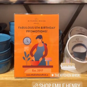
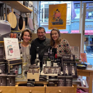
Recently I was approached by The Kitchen Whisk to create graphics for their 5th birthday celebrations. This is the store I get lost in on a Saturday afternoon. I know some people love bookstores for finding gems. This is where I find mine! With their fabulous store on Wicklow Street and a wonderfully designed website I knew I had a client who had high creative expectations, but with my experience building more and more in retail, I knew this was a challenge I was ready for. The initial request for a poster for the window with some table top posters and POS extended out to branded stickers, web graphics, and social media graphics.
The first thing I noticed about The Kitchen Whisk was the brand. It has a very strong confident orange brand with a clever illustration. The client showed me some images from cookbooks that influenced her and I was immediately drawn to a Spanish-Mexican cookbook. I could feel the illustration style I had in my mind start to come out. I felt the warm orange would work well with warm reds, cool blues and greens and give massive flavour for a striking presence in the window. This was then combined with my 4 chefs, each cooking, preparing and baking. Each with their own personality.
The finished product is a very strong design presence in store and across all communications.
Below are the four illustrations, Stephanie, Anita, Tara and Paula.


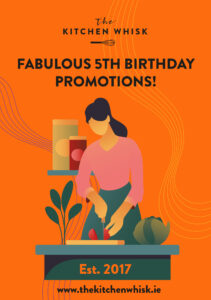
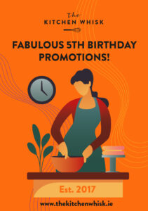
These translated easily to social graphics.


Here’s how they look in-store…
